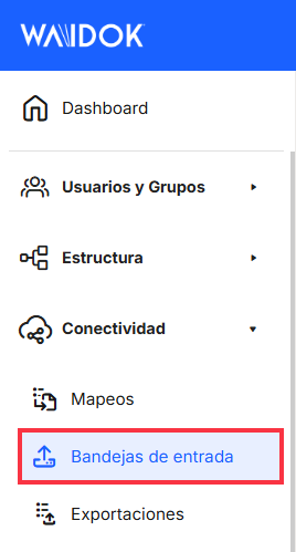
Menu. Input trays
 INBOXES
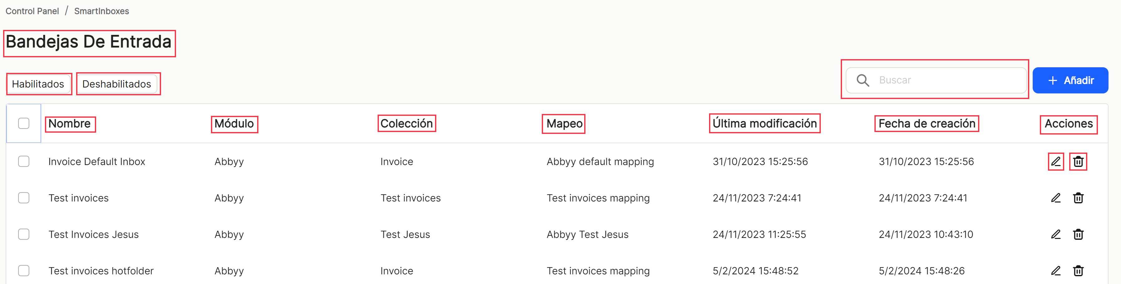
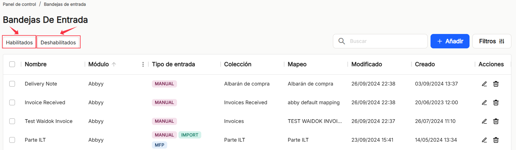
From this section, the user will have the possibility to generate and list all the inboxes for the ingestion of documents that the user needs, both for manual uploading and automatic uploading. Users will be able to see in a table a list of all the inboxes that have been defined, so that the documents that are inserted into the system use the values that have been configured for each of the inboxes. In this section you can register new inboxes and their characteristics in the application with the necessary data, search and/or display the list of all the inboxes, filtered by enabled or disabled, the current properties, a series of fields (properties) as well as sorting options and actions to execute.
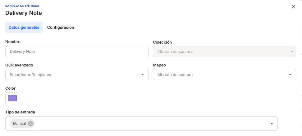
With"Add", the application displays a new subwindow to register a new inbox, where mandatory minimum fields to be filled in are required.
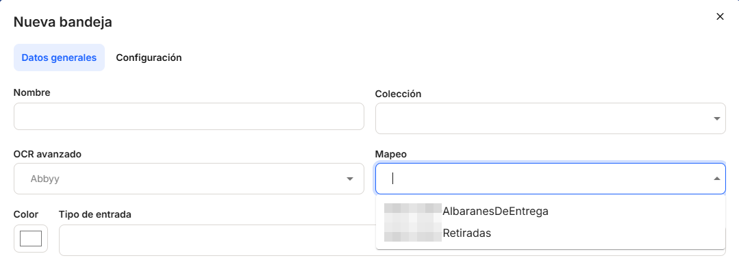
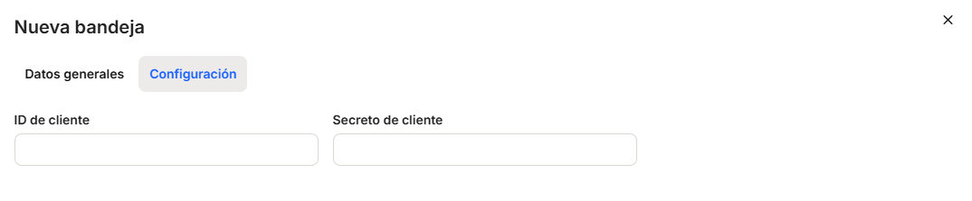
In the "General Information" section, you must enter the "Name," "Collection," "Mapping," "Module," "Color," and "Input Type.""Name" allows the use of free text for naming the input trays.
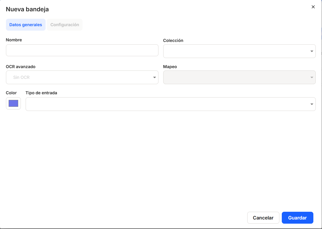
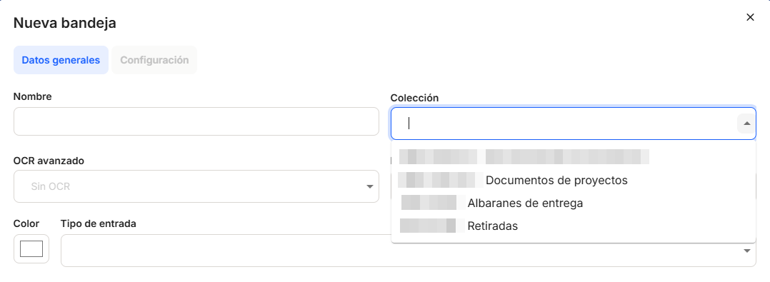
The"Collection" checkbox allows the selection of any of the collections already registered in the application, so that the documents that enter through each of the inboxes are classified in the collection indicated.
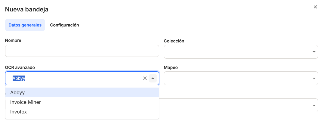
The "Advanced OCR" box will allow you to select, using the drop-down menu, the technology to be used to process the documents that enter that tray by OCR.
The "Mapping" box allows you to select, from the drop-down menu, one of the mappings that are already registered in the application, so that the conditions and properties of the mapping associated with that inbox are applied to the documents that enter each of the inboxes. The mapping options will be active when an OCR is selected to perform the mapping in the tray.
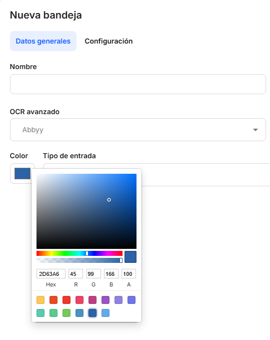
In addition, the"Color" option will allow the customization of each inbox for a better differentiation of the same in the automatic uploading of documents. By clicking on the color palette, a new Windows-style subwindow will be displayed, where you will be able to select the desired color by selecting the required shade with the mouse, which will also provide the RGB numbers (for the color palette).
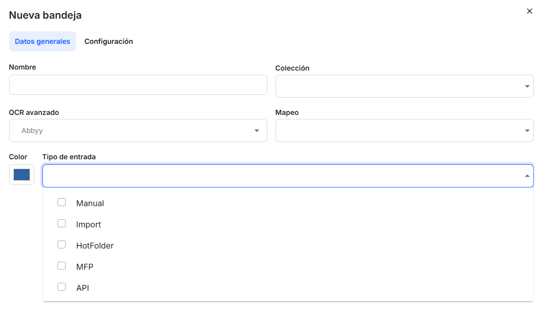
The "Input Type" box allows the user to determine what type of document input will be allowed in the defined tray. The options available are "Manual," "Import," "Hotfolder," "MFP," and "API." You can select all of them or only those you want to enable, using the drop-down menu that opens after clicking on the arrow or on the box itself.using the drop-down menu that opens when you click on the arrow or on the box itself.
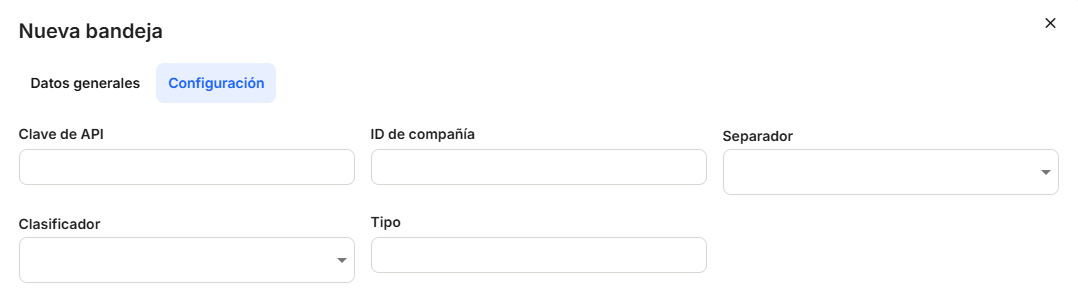
The"Settings" tab remains inactive and grayed out in this window, as it will not be activated until the inbox is saved with its data. To configure and complete these settings, the user must edit them inthe column of actions tobe performed on the collection in that line. The data entered in "Settings" may vary depending on the type of OCR selected in General Data.
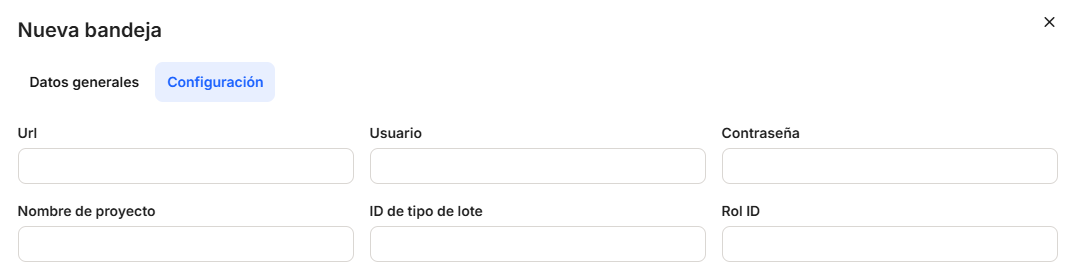
With the direct option to the quick access of "edit"  (displays the window with the inbox data of that line and its configuration), you access the window that allows you to modify the inbox configuration data, which are basically network connection and storage data.

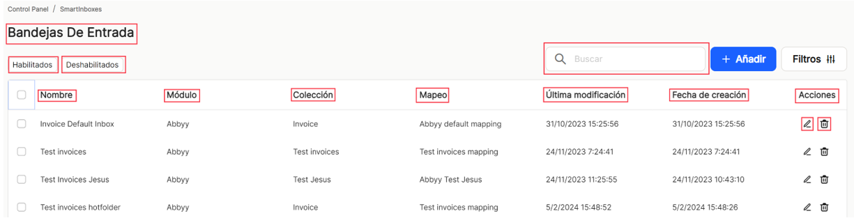
Once you proceed to"Save", you can see the list of inboxes generated in the table of that tab. Depending on whether the"Enabled" filter is checked (this is the one that appears by default when accessing the list) or"Disabled", the inboxes with this property will be displayed. In this case, the data of"Name","Module","Collection","Mapping","Last modification","Creation date" and the possibilities of direct access in"Actions" are shown. All properties will have the usual column sorting possibilities, which will be explained below, as they are always common for main and subwindows. In addition,
In all windows and sub-windows, after completing the minimum or corresponding data, click "Save" if you wish to continue recording a new property or its configuration, or "Cancel" if you do not wish to save.
The"Filters" option allows you to display a new subwindow where you will be able to perform searches on the inboxes that have been created.
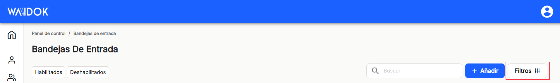
In the "Filters" window, it allows the conjunction of searches by terms, together with the status of the inboxes,"Enabled" or"Disabled", as well as the possible input types, such as"Manual,"Import", HorFolder","MFP" or"API".
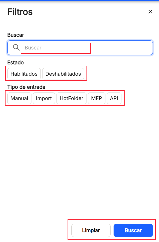
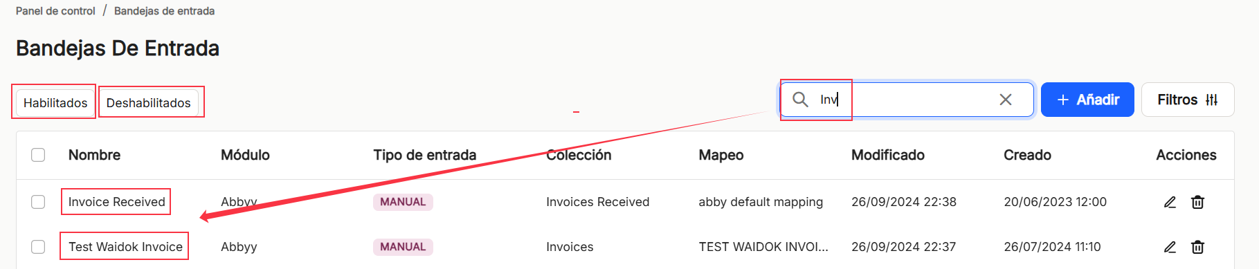
Using the"Search" option, we can locate and display in the table, those properties that contain in the"name" that string of characters.
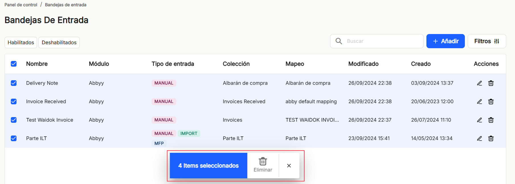
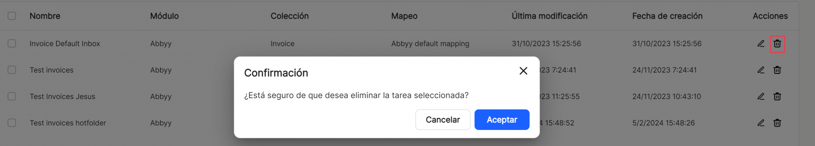
If an item (user) or several items are selected, the application opens a submenu, which offers the"Delete" option, which deletes the selected inbox or inboxes.
As in the rest of the sorting options of the application, when displaying a table with the list of inbox properties, it will show different columns, which will be displayed in the same way as in the other sorting options of the application.The"Name","Module","Collection","Mapping","Last modified","Date of creation" and the possibilities of direct access in"Actions" are shown. All properties will have the usual column sorting possibilities, which will be explained below, as they are always common for main and subwindows. In addition, "Shares"which contains the direct options to the shortcuts "edit" (displays the window with the property data of that line and its configuration) and "delete"  .
.
Before performing any display operation, the use of the"Enabled" or"Disabled" filters must be taken into account, since they will condition the results to be obtained.
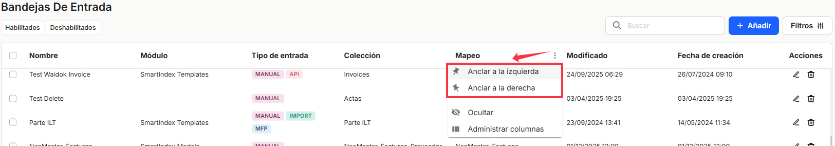
The table listing the properties of the inboxes will allow you to view and sort the different properties shown and mentioned above. You can view the resultsin different ways using thedifferent display options for any of the properties.
You can attach the ones you need on the right or left.
and hide or managewhich columns aredisplayed.
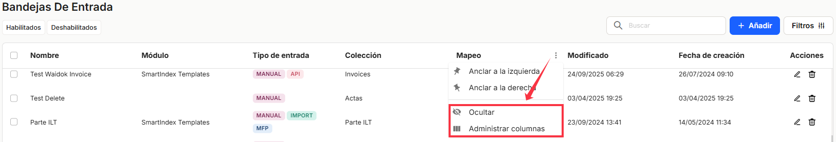
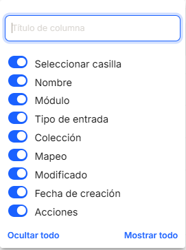
Thesesettings are not saved and are only applicable while the user is in the window displaying the task list.
With the direct option to the quick access of "edit" (displays the window with the property data of that line and its configuration), you access the window that allows you to modify all the data and parameters of the collection.
Direct access "delete" deletes the property from the application, displaying a message for confirmation or not before the action takes place.
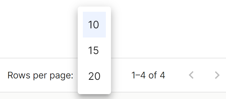
In the lower right part of the table, the total number of results obtained is shown, either without applying any type of search or filtering or applying any of the possible options. The system shows by default 10 lines per table and screen, allowing to show 15 lines or 20 lines per table and screen. It also allows forward or backward navigation in the displayed lists, depending on the pagination set.
No comments to display
No comments to display